Dusty Cedar Color Inspiration
The dusty cedar color is another one of Pantone’s top picks for Fall 2016. According to Pantone, the shade is a version of pink that is more suitable for fall and winter, excluding “warmth and welcome.” This color reminds me a lot of Pantone’s 2015 color of the year, marsala. What do you think? I like it but I think a little goes a long way. Like, I might buy a dusty cedar colored vase, but I’m not gonna be painting my living room this shade anytime soon.
I’ve been seeing dusty cedar paired with black and grey a lot, which is fine and dandy, but I think there’s more to it than that! So, for the mood board and color palette I created, I went full out with the floral colors. Full. Out. It was difficult to find exact color matches to create the mood board; most seem to either use a deeper, darker shade like the aforementioned marsala, OR a lighter, less intense shade. It’ll be interesting to see if the “true” dusty cedar color will catch on in the upcoming months!
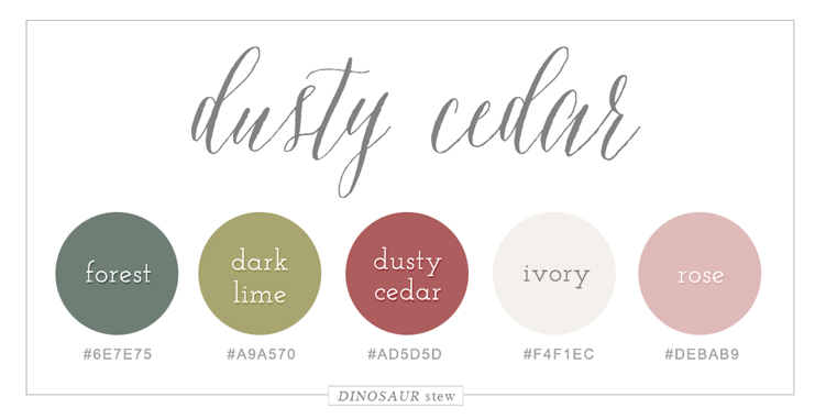
Dusty Cedar Hex Codes
Forest: #6e7e75
Dark Lime: #a9a570
Dusty Cedar: #ad5d5d
Ivory: #f4f1ec
Rose: #debab9

Dusty Cedar Color Palette For Web
I’ve gone ahead and added this dusty cedar color palette to our color palettes inspiration page, which is a great resource for you to use when searching for colors for your next project! I especially love the idea of using these colors to create some super pretty printables, like wedding invitations.
You tell me: is dusty cedar for you, or are you having a hard time getting on board with this color? Which Pantone Fall 2016 Color do you like best? If you liked this post, stay tuned in to our blog…we’ve still got a few more Fall 2016 color mood boards to reveal!
