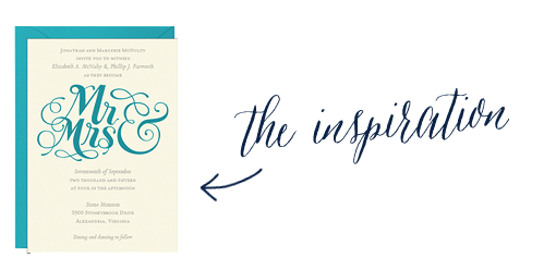
With wedding season comes wedding invitations, and I’ve seen my fair share of ugly DIY creations this year. Just because you’re on a budget and don’t want to spend $$$ on fancy invitations does not mean you’re stuck with creating a Comic Sans adorned document in Microsoft Word. Grab a copy of Photoshop and whip up this trendy, Paper Source -inspired wedding invitation in minutes.

Step One
The first thing I want to do is open my new document in Photoshop. Click File >> New and enter in your dimensions as necessary. I want my invitation to fit into an A7 envelope, so I’m going to aim for a 5×7″ invitation. Because we’re printing the invitation, we need to make sure it’s made at 300DPI, which is perfect for a quality print. I’m going to keep my color mode at RGB; if you’re printing on a home printer, you likely will want to use RGB, too. If you’re going to be printing with a professional company, CMYK might be the better option. Check with your printer if you are unsure.

Step Two
Let’s start by adding the Mr. & Mrs. Text in the upper center of the invitation. Click on Layer >> Add New. Now, click on the text tool (the “T” icon) and click anywhere on your invitation to begin typing. I’m going to change my text color to #A8E5D3 by clicking on the color area (it should say “set text color” when you hover over it) on the top toolbar. This is also where you will select what font you want to use. I’m going to use the font “Carolyna Pro,” which can be downloaded here (no, it’s not free, but you only get married once, so treat yo’self!).

All I’m typing in right now is “Mr,” then, I’m going to open a new layer (Layer >> Add New) and repeat what I just did, only this time I will type “Mrs.” Position these layers how you want them to appear by using the Move tool and select between layers using your layers palette.

Step Three
Now, lets add the “&”. I’m going to change fonts for this and use “Austie Bost in Wonderland,” found for free (you’re welcome) here. Type it in and position it in-between the “Mr” and “Mrs” you just added.
Step Four
It’s time to add in the important stuff! I don’t love the hoity-toity style of the paper-source invitation, so I’m going to liven it just a little bit, but I still want to keep it classic with my font choice. I’m going to use the font “Sanford” because I just discovered it and think it’s pretty bomb. Let’s start by adding in all the text we want; we can worry about formatting later. To add the text here, I’m going to add it in a slightly different way: click on the text tool as usual, but instead of just clicking the cursor anywhere in your design, draw a box that surrounds the entire design. This will create a “text box” and will make it easier to center our text.

Step Five
Let’s format the text so it isn’t so plain looking. Open your Character palette by going to Window >> Character. This palette offers you many options for formatting your text, so play around with the options and change the letter spacing, capitalization, etc. to your heart’s desire! Here’s what I came up with:

Step Six
You might notice that there is slightly more white space on the top than on the bottom, so I’m going to rearrange my layers a little bit to balance things out. You can do this with the Move tool by selecting the layer you want in the Layers Palette and clicking and moving it where you want it, or use your arrow keys to nudge the layer slightly in the desired direction. If you want to move multiple layers at a time, select them in your Layers Palette by holding down either the shift key or the command key as you click the layers you want included.
Step Seven
The last thing I want to do is to jazz up this bad boy in the form of a border. Open the chevronstripe.psd (available for download below) and copy and paste it into your invitation design. Move it up to the top of the invitation and position it as desired. Then, duplicate the layer (Layer >> Duplicate Layer) and move it upward. To change the color, in your Layers palette, click on the name of the layer and select “Color Overlay.” Change the color to #A8E5D3.
After this final step, this is what the final product should look like:

Pretty, right? I actually like it much better than the Paper Source invitation I was using as inspiration.
And just for funsies, here’s a video of the creation process (or, should I say, here’s a video of the creation process on steroids and set to snazzy music):
